

Latest News


Author Anne Lamott
“I feel like I’m in my living room talking with my closest friends,” Lamott said.
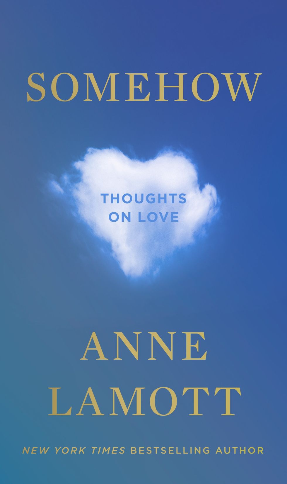
In her 20th book, “Somehow: Thoughts on Love,” she goes back in time, writing about her own personal life experiences in a candid way, about her family, recovery and her faith. Lamott relates coming face to face with intense emotions and multiple epiphanies and lessons she’s learned.
The book explores the transformative power that love has in our lives: how it surprises us, forces us to confront uncomfortable truths, reminds us of our humanity, and guides us forward.
“Love just won’t be pinned down,” she says. “It is in our very atmosphere and lies at the heart of who we are."
“We are creatures of love,” she writes on her website describing the premise of the book.
Lamott is a progressive writer. She married for the first time at the age of 65, and has been sober for 37 years. She shares a life with her husband, Neal Allen, who is also a writer, her son Sam Lamott, and her grandson. Her family makes up the main characters throughout the book, reminiscing on escapades together.
“To have a heavy-hitting writer here is just wonderful, I have been following her since San Francisco, and when I heard she was in Poughkeepsie I bought tickets right away,” said Lamott fan Suzanne Sagan.
The Bardavon audience was filled with women from the ages of 34-70, some were able to convince their husbands to tag along and listen to the conversation. All attentive to her, laughing at the jokes and even attempting to sing her happy birthday.
Conversation topics ranged from the themes in her book, to sobriety, to telling stories about being a mother.
Learning about how to help yourself first, if you want to feel the love you have to spread the love, aging, relationships, having your cup filled full with your own water, and learning from your mistakes.
“That’s what life is like, slipping on a cosmic banana,” Lamott declared.
“As with all of her deceivingly simply rendered pieces, Lamott’s foibles are central to the 12 stories told here. Reconciling her own flaws as the key to tolerance is implied. Falling short is a given, especially when seeking to understand folks whose views are different from hers, particularly when they’re on the political spectrum. But demonstrating love to those who cause harm just might be too much of a reach for her — that stuff is for saints; it’s next-level wellness. Yet, Lamott strives,” Denise Sullivan writes for Datebook, a San Francisco Arts and Entertainment Guide.
Lamott was able to quote well known names such as Susan B. Anthony, Carrie Fisher, and Mother Theresa. During the conversation, she often turned to quotes that helped her create the mindset she has today, and spreads to the audience.
The talk was presented by Oblong Books in partnership with Bardavon Presents.
 Penguin Random House

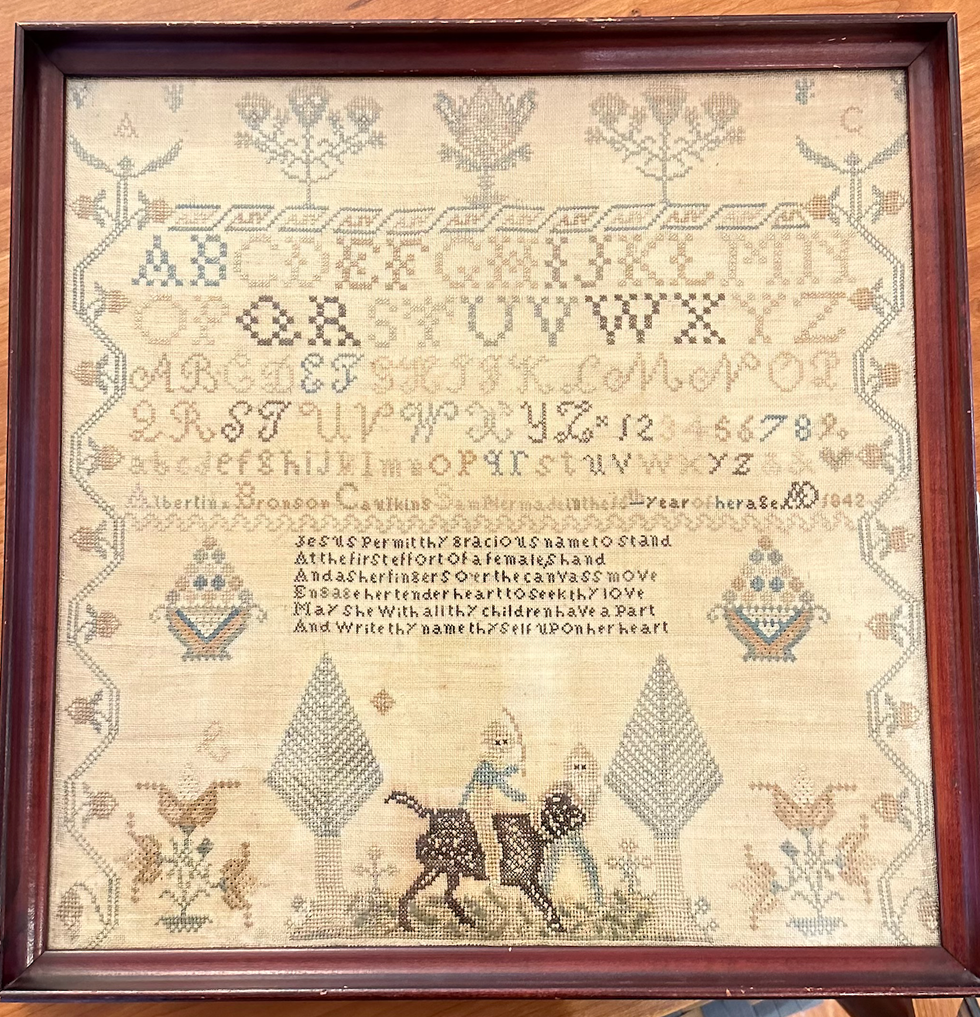
Alexandra Peter's collection of historic samplers includes items from the family of "The House of the Seven Gables" author Nathaniel Hawthorne.
It’s not that Peters has delusions of grandeur, with those small black or white cards a part of the fantasy. In the past few years, her samplers have gone on outings to historical societies and exhibits. Those small black cards are souvenirs.
About 27 of the pieces from Peters’ collection have just left home again, and are featured at the Litchfield History Museum of the Litchfield Historical Society in an exhibit that Peters guest curated along with the historical society’s curator of collections, Alex Dubois.
 A needlework example.Cynthia Hochswender
The exhibit is called “With Their Busy Needles,” and it opens with a reception on Friday, April 26, from 6 to 8 p.m. (The exhibit will remain open until the end of November.) Peters will give a talk called “Know My Name: How Schoolgirls’ Samplers Created a Remarkable History” at the museum on Sunday, May 5, at 3 p.m.
Although Peters was first attracted to samplers as a form of art and craft, she has come to see them as something more profound. Each sampler tells a story, but you have to know how to read between the lines of thread and fabric. Peters has become an able and eloquent curator of what were once educational tools just for young girls and women. She can look at one and give an educated guess about who made it, how old they were, where they lived and how affluent their family was (or wasn’t).
Some samplers were made on linen, others were made with silk. Some linens are fine, others are rough and homespun.
“Some of my favorites are made on what’s called ‘linsey woolsey,’” Peters said. “It’s a mix of linen and wool that’s been dyed green. It was uncomfortable to wear, but it looks great on a sampler!”
Younger girls often worked first on learning darning stitches, and would make simple samplers with letters of the alphabet. More advanced stitchers might create genealogies or family trees. Peters particularly loves to find multiple examples from one family.
“I have a couple sets that were done by sisters,” she said, “and a collection from the family of Nathaniel Hawthorne,” the American author of “The Scarlet Letter.”
All samplers, though, show the importance of girls within families, Peters said.
 Alexandra Peters, left, is exhibiting needlework samplers from her collection at the Litchfield Historical Society Museum.Cynthia Hochswender
“Parents were excited about their girls getting an education and coming out in the world and displaying their accomplishments. It’s different from what we think.”
“We tend to scorn or disrespect things made by women, particularly if they’re domestic. But before the Industrial Revolution, all work was done at the home, by women and by men. There weren’t jobs that you went to, you did the work at home. Samplers, and needlework, are the work of women, the work of girls.”
Samplers were rarely sold, Peters said, except ones made to help Southern Blacks to escape slavery.
“They were made anonymously and sold at anti-slavery fairs from the 1830s to the 1860s. I have one that can be used as a potholder and it says, ‘Any holder but a slaveholder.’ I have another that must have been a table runner that says, ‘We’s free!’ We’d see some of them as offensive now, but they weren’t at the time; they were joyful.”
Every sampler tells a story, and Peters is an able and entertaining interpreter of those tales. Learn more by visiting the Litchfield History Museum and seeing the exhibit (complete with explanatory museum cards) and come for her talk about samplers on May 5. Register for the opening reception and for the talk at www.litchfieldhistoricalsociety.org/exhibitions.